Monday, April 5, 2010

Promo


Promo cards for my new website. The red is Offset Lithography printed in the Borowsky Center and the black embellishments are done by hand with Rapidographs to make each card unique. Holler!

This is Why We Can't Have Nice Things...


The MFA Book Arts/Printmaking program has an annual 5x5 print exchange open to all current students and alumni. This year's theme was "This is why we can't have nice things". This was the first thing I thought of when I heard what the theme was and then I could think of nothing better. Printed Offset in the Borowsky Center for Publication arts with the awesome Amanda D'Amico.

Sunday, February 21, 2010

Website(s)

I was commissioned to do a website for a friend of mine who is a funeral director in Peterborough, New Hampshire. Designing a website for a funeral home may sound a little drab, but it was actually quite fun... mostly because I got to travel to Peterborough to take photos, party with good friends, and cover The Bossman's office with tin-foil (it was pay-back). Anyways, the site is finally up and functioning, and can be viewed at www.jellisonfuneralhome.com


Having the satisfaction of completing someone else's website gave me the motivation to FINALLY finish my own. I will continue to use this blog to post about current works in progress and the latest news of what I'm up to, but to view my work on a more "professional" platform you can go to www.amandabenton.net


both sites were created through wix.com

Tuesday, November 24, 2009

Testing it out...


I've been taking this screen printing class and trying to experiment with how my drawing style can translate into prints... this is one of those of those experiments and I was really happy with how the duo-tone tree turned out. I'm still working on it... here's some close ups:

(the background is one solid color, but the light makes it look funky)


oh and Happy Thanksgiving!

Saturday, November 7, 2009

More Stuff I've done

I'm taking a screen printing class for fun... and because I can't not be a student. I write a lot of thank you cards. These are some cards I made...


Here's a logo design I submitted for a competition. It didn't win, but I'm still pretty happy with it.

And We're Back!


I was recently in a show with 3 other friends and former classmates at The University of the Arts. The theme was "Home Sweet Home" and can be seen at Off the Wall Gallery and Dirty Franks, located at 13th and Pine, Phila PA. For this show I worked on a series of portraits, drawn with rapidographs each with a hand-made paper frame, also drawn with rapidographs. I tried to create a storyline between the portraits that were made up of both real and imaginary people. I screen-printed a woodgrain pattern to mimick that of wood panelling and then arranged all the portraits in an enviroment that was meant to resemble a wall of portraits in someone's home.

The show will be up through December 4th, go check it out!


"Crazy Old Guy"


"Lovely in the Home"


"Brown Rice"


"Button-Pie"


frame detail


"Bobby Ben"


"Bobby Ben" detail

Wednesday, May 6, 2009

MFA THESIS EXHIBITION!!!

Come to our opening this Friday! I have some really awesome, super talented classmates, and the opening of our MFA Thesis Exhibition is this Friday at the SkyBox gallery at 2424 Studios.

I'm pretty sure it's gonna be awesome and that you won't want to miss it.


poster printed by Bobby Rosenstock


http://2424studios.com/wp/

Benton's Bazaaro

PHinally...

I finished my thesis, installed the show, defended/critiqued, and the opening reception is this Friday.

For those of you who don't know what I've been up to, I've made a mock woman's magazine filled with satirical articles and commentary on the way women are portrayed in the media. At this point I'd really prefer to never talk about or look at another fashion magazine again, but if you're interested...here is something that resembles an artist's statement:


The media is a central element of modern life, and gender and sexuality remain at the core of how we think about our identities. With the media containing so many images and messages about men, women, and sexuality, it is unlikely that these ideas would have no impact on our own sense of identity. Women’s magazines offer a confusing and contradictory set of ideas. Many of their messages are positive, communicating the idea of an assertive and independent woman, and yet the emphasis on looking beautiful is generally inescapable. For the most part, woman’s magazines are reproducing a smartened-up version of the old-fashion idea that a women’s existence revolves around landing the right guy – although the technique has changed from great cooking to great sex. The fundamental difference between then and now is that the stronghold on women’s lives and aspirations now masquerades as girl power. For every article on being an independent woman and career planning, there’s another one on attracting a boyfriend and honeymoon destinations. With every empowering statement and self-esteem boost there is a make-up ad to cultivate insecurities for which “solutions” can then be sold.
People consume hours of television, flip through magazines, surf the net, pass billboards, go to the movies, and are generally unable to avoid popular culture and advertising. There is an overwhelming amount of information going into people’s heads. Even if they don’t see it as information, or say they’re not paying attention to it, even if they are able to criticize it, and are aware that it is constructed fiction – they are unable to escape the influence of its content. The magazine I created, Bazaaro, highlights these contradictions and points to the absurdity of a culture that we ourselves have created and simultaneously undermine. As opposed to traditional advertising and media efforts, my work provokes the viewer to pause and think, rather than blindly consume.


As an artist I’m interested in having a conversation with the community at large, which is why many of my pieces have an interactive element to them. I like to throw my viewers off guard and trick them into looking at a piece of art or considering an idea that they may have overlooked. Is this a real magazine? Is it a joke? Is it art? I welcome all of these questions and more. I don’t see my work as circumscribed by the art world, and I encourage my audience to take action based on the ideas they discover in my art.

I need to take better pics, but here's a preview:


You can preview the entire magazine here - the text is too small to read, so I guess you'll just have to buy one!!!!


Here's a look at the show installation:


<<Ahem>>

Sunday, April 19, 2009

Etsy 'n stuff

I've finally set up an Etsy shop.


This is very exciting.

The four books that I've made while in Grad school are now available for sale on my Etsy account and will continue to be, until I sell out...which I'm assuming will be a while since two of the books were printed in an edition of 100 and another is unlimited. I'm registered under my press name ABentley Press. Go check it out, shop around, bookmark it, tell your friends.

sweet.

In other news... My book "Her Name was Mona" has been accepted to another show. The book is on view at the Heart & Hands Exhibition in Love Library, University of Nebraska-Lincoln from April 1 – 30, and then will be shown at Criss Library, University of Nebraska-Omaha, in May. And it's available for sale at my Etsy shop!

I keep being pleasantly surprised that this book is being so well received. I suppose its just self-doubting human nature at its best...but I'm happy nonetheless.


info about my thesis work is coming very soon. promise.

Tuesday, March 10, 2009

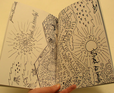
What is Beauty Book is Published!


I just published a book through lulu on the "What is Beauty?" project that I curated last semester. It is an 125 pg, full color book, 5.83" x 8.26" perfect bound book, and contains every postcard that I received through the project and explores the meaning, implication, and value of beauty. You can check out some of the spreads below, or go to lulu, check out the preview, and buy a copy! --->
Support independent publishing: buy this book on Lulu.


I also made a nice clam-shell box to contain all of the postcards that I received. Since I didn't give any sort of restriction for the size, many of the entries were quite larger than regular postcard size, and so when I made the box I need to have two separate compartments to contain everything. What I came up with was a clam-shell box with a removable shelf, as seen below.


Tuesday, March 3, 2009

justconsulting.

My friends at The Institute on Religion and Public Policy hired me to do some more design work for a new consulting firm that is in development. The concept behind "justconsulting" is just that - they're a consulting firm with a "no strings attached" mentality ... just consulting and also Just consulting, with a capital J, fair-minded and unbiased.

The concept for the design was inspired by the ideals represented by "Lady Justice" - or the moral force that underlies the legal system. It was also expressed that the design should have a more contemporary and trendy look, so rather than go with the traditional blindfold/sword/scale representation of "Lady Justice", I went with the symbol of the torch and flame. The torch is a common emblem of both enlightenment and hope, and is known to signify truth, knowledge, and purity – all things that this new firm hopes to signify. I played around with taking the period out at the end, but ultimately decided to keep it as I felt it drove home their concept of just being a Just consulting firm.

Above is the final design they chose to go with, below were some of their other options.


The current deadness of my blog will hopefully not persist for too much longer. I'm working on a major (and by major I mean, much more work than I anticipated) project for my Thesis exhibition. I'll be posting more on that later, after I get over a few more hurdles...and flip out because it's already mid-term. oye.